Be Future Ready
A website for a nonprofit working across Canada, Nigeria and South Africa. It helps people find programs, shows partners the impact, and lets staff run all the content themselves. I designed it and built it in WordPress.
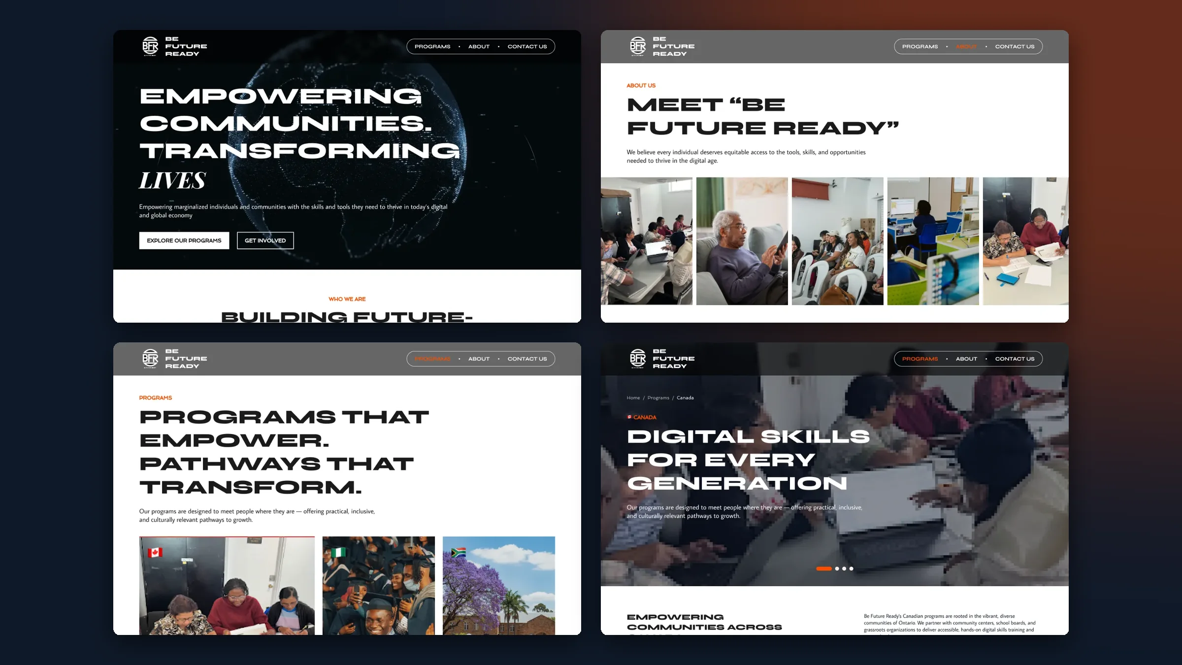
Overview
Be Future Ready (BFR) runs digital skills training, career programs and entrepreneurship work in Canada, Nigeria and South Africa. As it grew, the old website couldn’t show how much it does, couldn’t speak to all its audiences, and needed a developer for every update.
Three countries, one old site
Programs in each country were hard to find, and the impact was hard to see.
A site that grows with them
Help participants find programs, show partners and donors the impact, and let staff update everything.
Many people, many reasons
Participants, partners, donors and volunteers all arrive with different questions.
My role
I redesigned the whole website and built it in WordPress, so the team can manage it without me.
- Information architecture
- UI design
- UX writing
- Responsive design
- WordPress build
- Content management
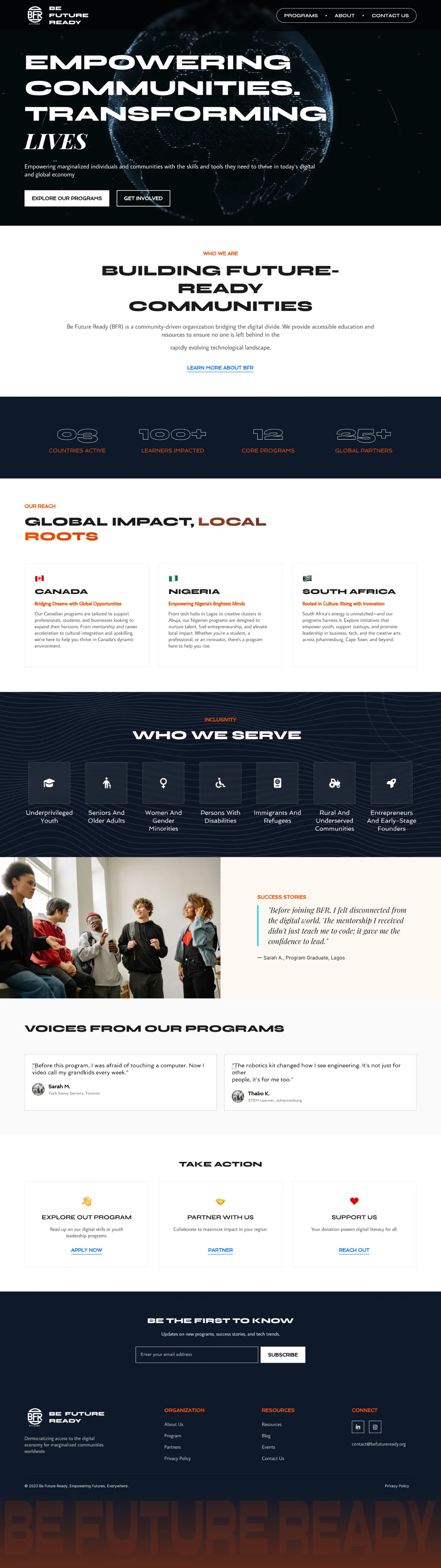
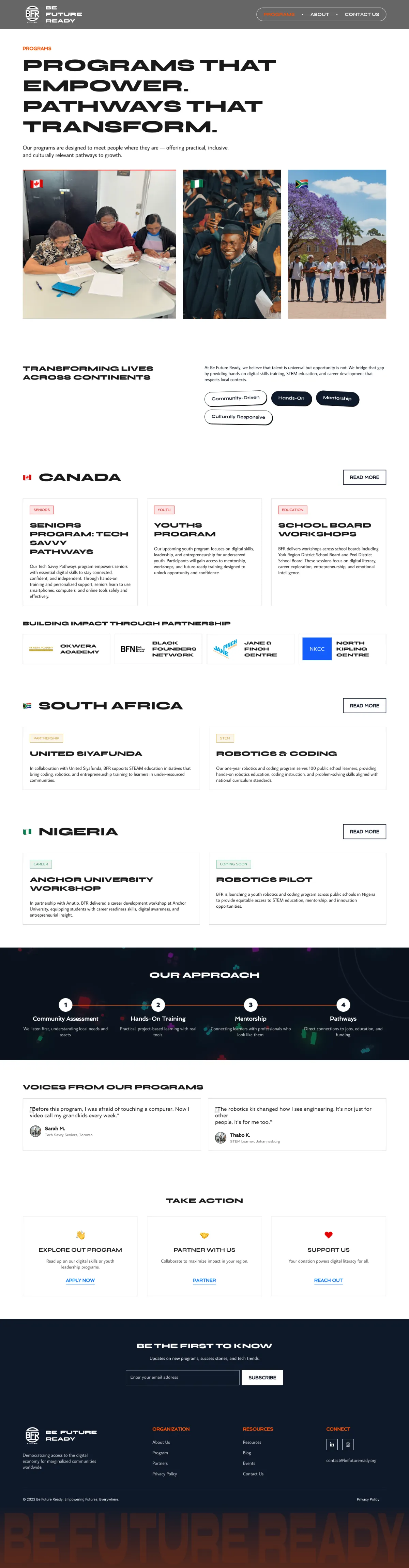
- Structured14 primary pages and 3 country hubs, with a path for each type of visitor.
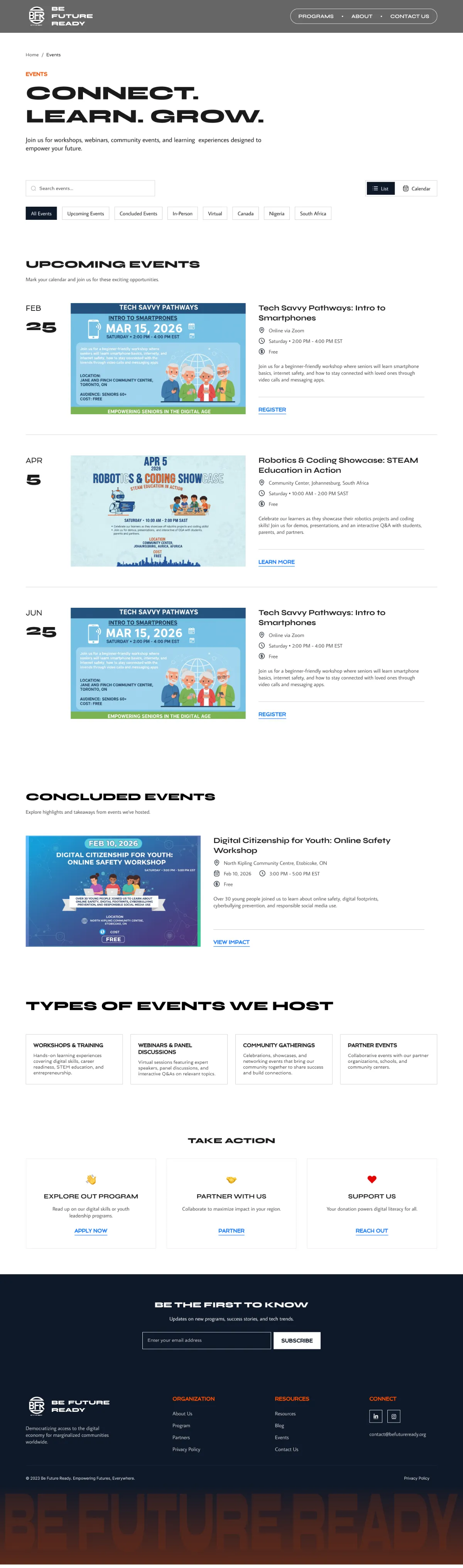
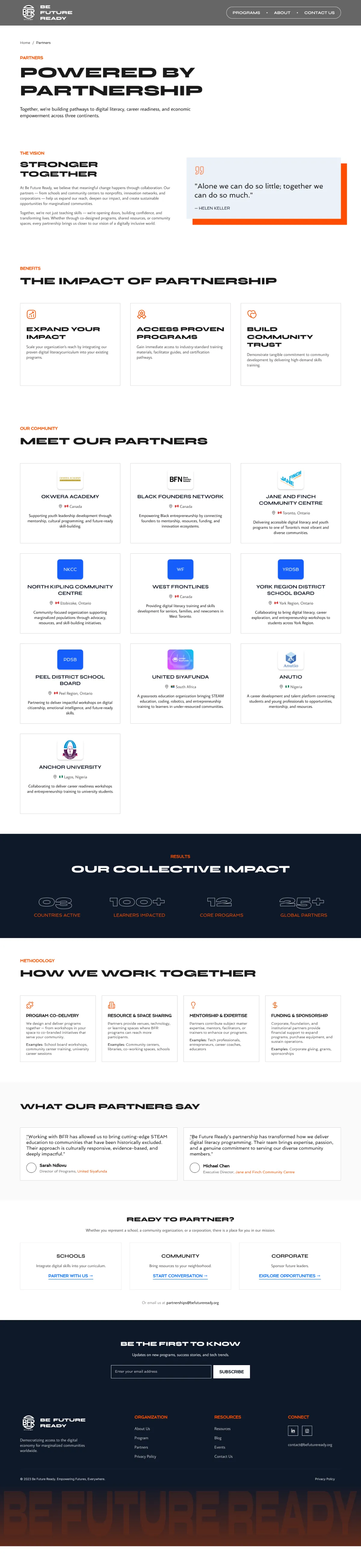
- DesignedEvery page at 1440px desktop, 768px tablet and 375px mobile, including events, resources, blog and partners.
- BuiltThe WordPress site and a content setup that lets non-technical staff manage programs, events, resources and blog posts.
Key decisions
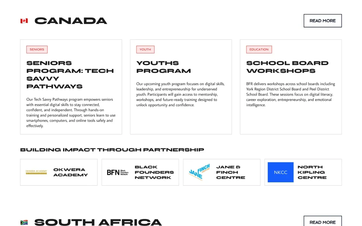
One site, a hub for each country
- What I chose
- A single website with a program hub for Canada, Nigeria and South Africa, each with its own programs, events, partners and stories.
- Why
- Visitors see BFR as one organization, but still find what’s happening where they live.
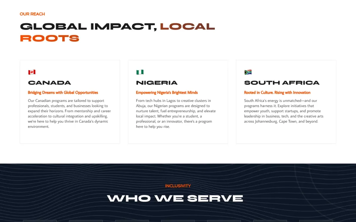
A clear path for every visitor
- What I chose
- “Take action” paths on every key page: explore a program, partner with BFR, or support the work.
- Why
- Participants, partners, donors and volunteers each get a next step that fits why they came.
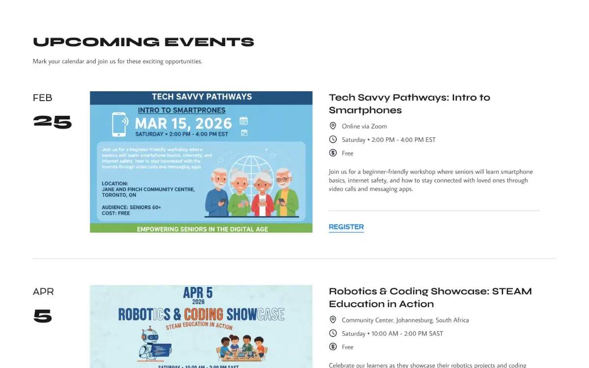
Events and proof that build trust
- What I chose
- Upcoming and past events with photos and outcomes, partner showcases, and real stories from participants.
- Why
- A nonprofit earns support by showing its work. Past events prove programs actually happen.
The pages
Hover or tap a page to scroll through the whole thing.




Results
- One global presenceA single website now serves three countries, with local content for each.
- Staff in controlThe team manages programs, events, resources and posts without a developer.
- Fewer questionsSupport questions dropped by 60% after the FAQ and resource sections launched.
- People stay longerAverage time on page rose from 0:45 to 2:30 across the site.
Design system
Three colours do all the work: deep navy for weight, a bright orange for action, and white for space. Headings are set wide and in capitals, so every page feels confident.