Luméa Skincare
A premium skincare shop that explains the science, helps people find the right products, and makes buying feel safe.
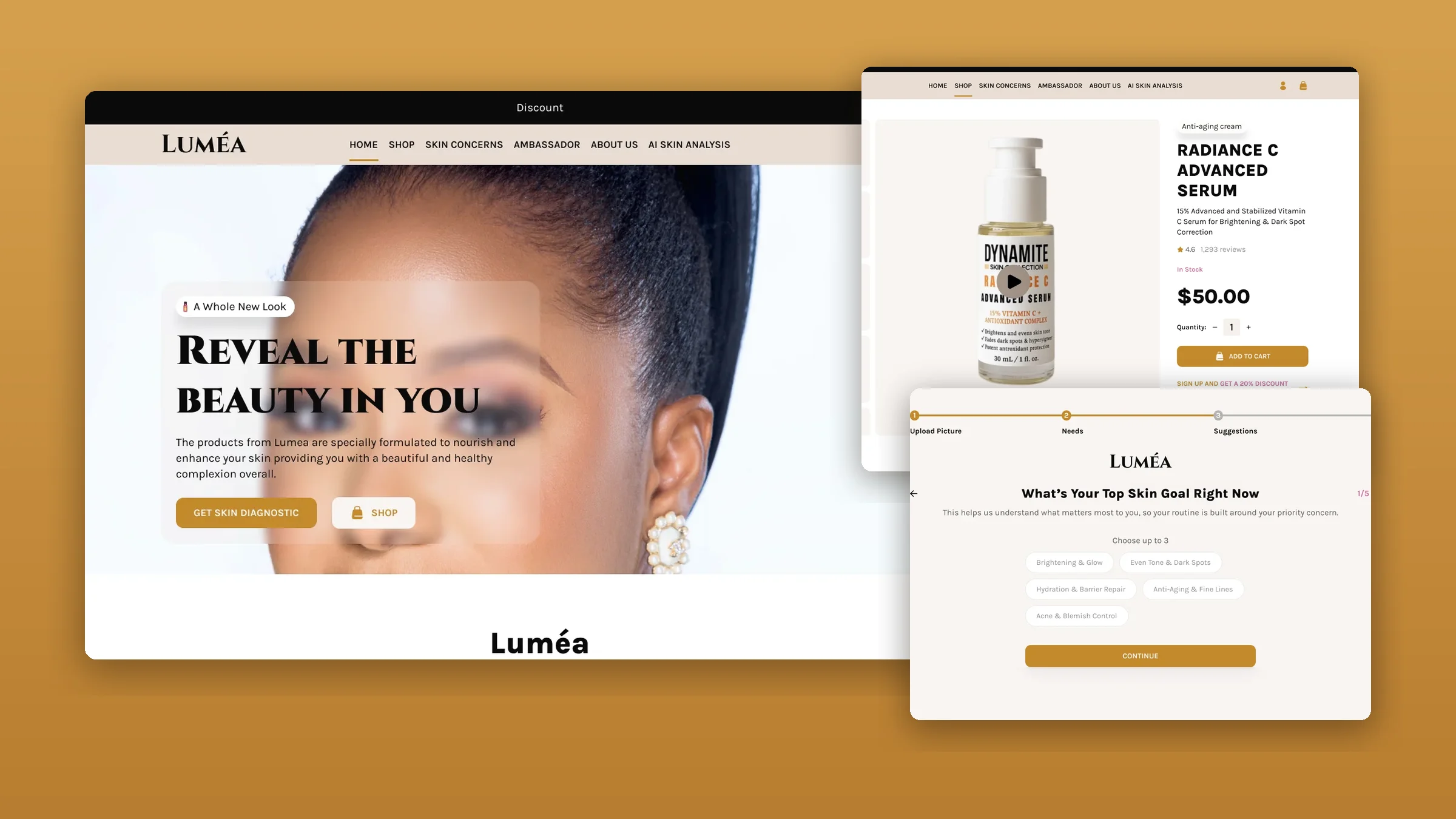
Overview
Luméa makes science-backed skincare for sensitive and melanin-rich skin. It needed an online shop that felt premium, taught people what is in each product, and turned interest into confident purchases.
Too much to say at once
Ingredient education, product marketing, reviews and shopping all had to share one site without overwhelming visitors.
Trust, then purchase
Help customers understand why a product works for their skin, find it quickly, and buy without second-guessing.
A complete shop
Product discovery, ingredient-based shopping, an AI skin consultation, product pages, reviews and video content.
My role
I was the only designer, from research to the final screens, and I set up the design system.
- UX research
- Information architecture
- UI design
- E-commerce journeys
- Design system
- Responsive design
- StructuredThe information architecture and the journey from first visit to purchase.
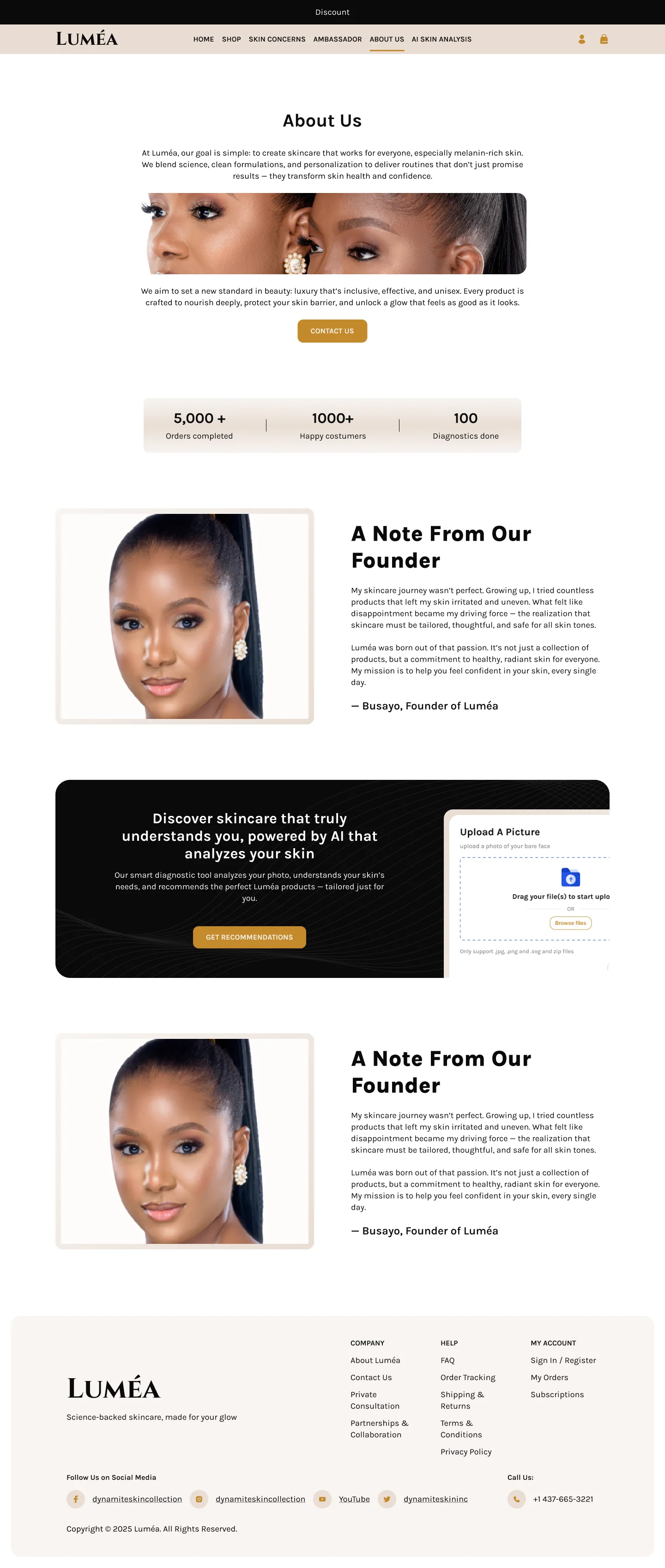
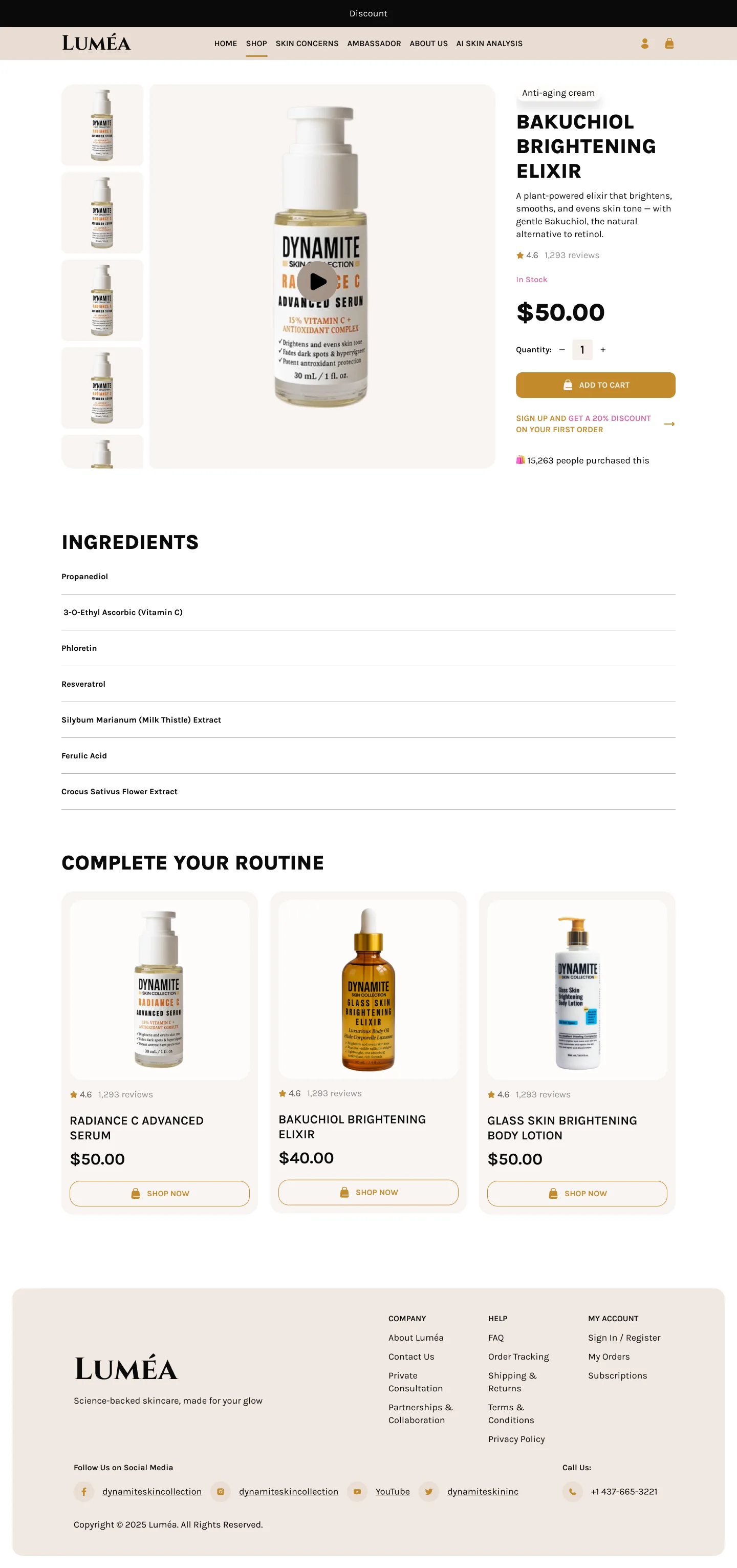
- DesignedEvery page: home, shop, product pages, the skin diagnostic and about.
- SystemisedColours, a type scale and reusable components so new pages stay consistent.
Key decisions
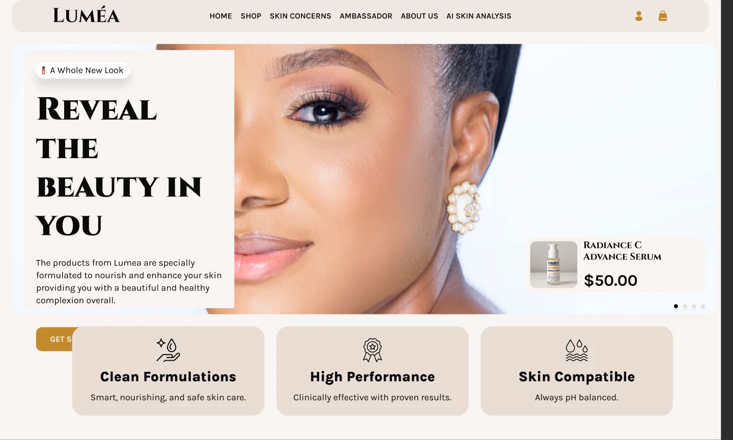
Shop by ingredient, not just by product
- What I chose
- An ingredient row on the homepage (shea butter, cocoa butter, mango butter, vitamin C) next to the bestsellers.
- Why
- Luméa’s promise is science. Letting people start from ingredients they already trust makes that promise easy to act on.

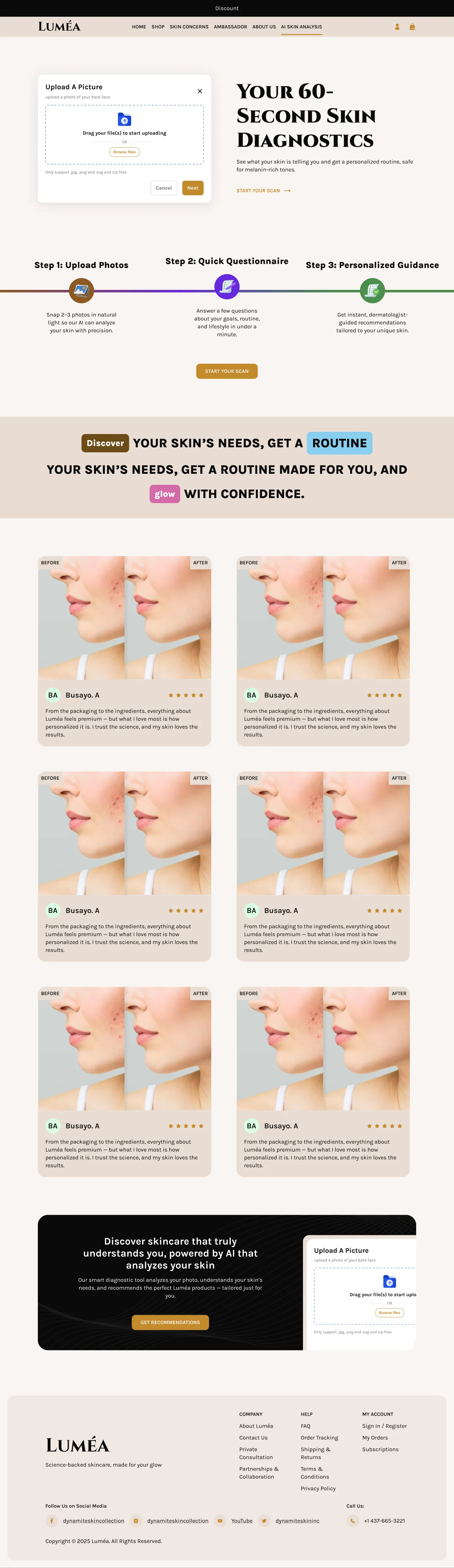
A skin quiz that feels like 60 seconds
- What I chose
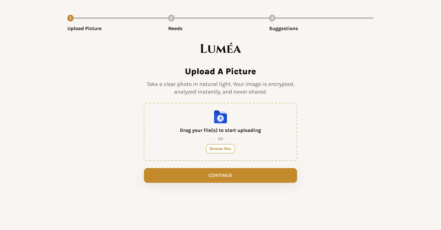
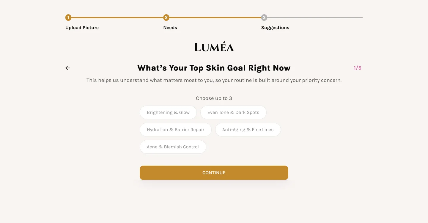
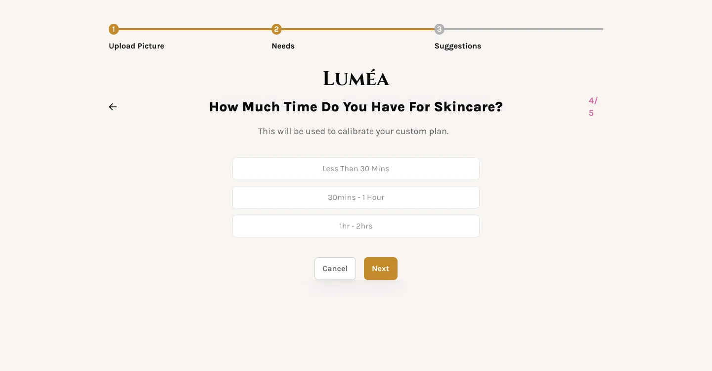
- Three clear steps, upload a photo, answer a short quiz, get a routine, with one question per screen and a visible progress bar.
- Why
- Choosing skincare is personal and confusing. A short, guided flow turns “what should I buy?” into a recommendation.
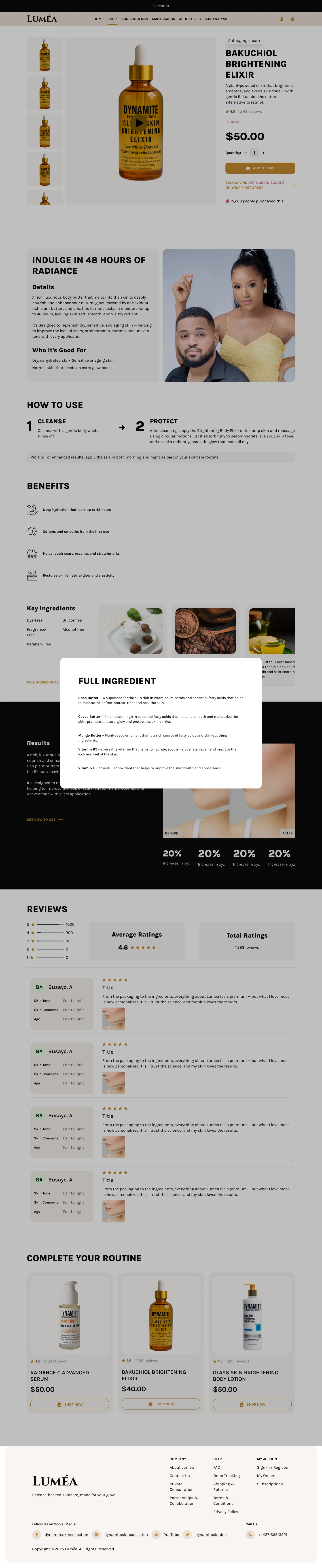
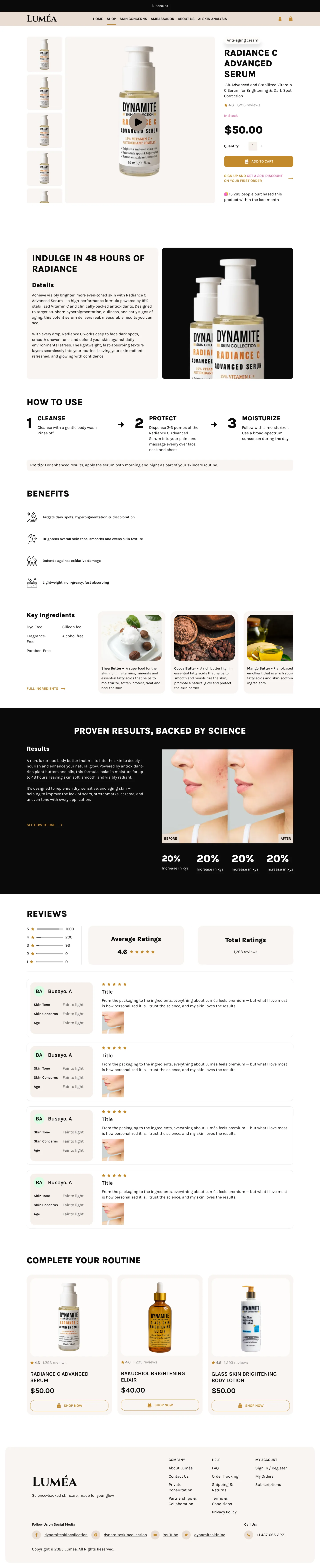
Product pages that answer every doubt
- What I chose
- How to use, benefits, key ingredients with a full-ingredient pop-up, before and after results, reviews by skin type, and “complete your routine”.
- Why
- Each block answers a question buyers ask before paying, so they don’t leave the page to find it.
The screens
Hover or tap a page to scroll through the whole thing.
Design system
A warm, quiet palette of cream and gold, Karla for text, and a type scale built on a 16px base with a 1.2 ratio, so every heading size is related.

Effective skincare, backed by science.