Shenandoah University
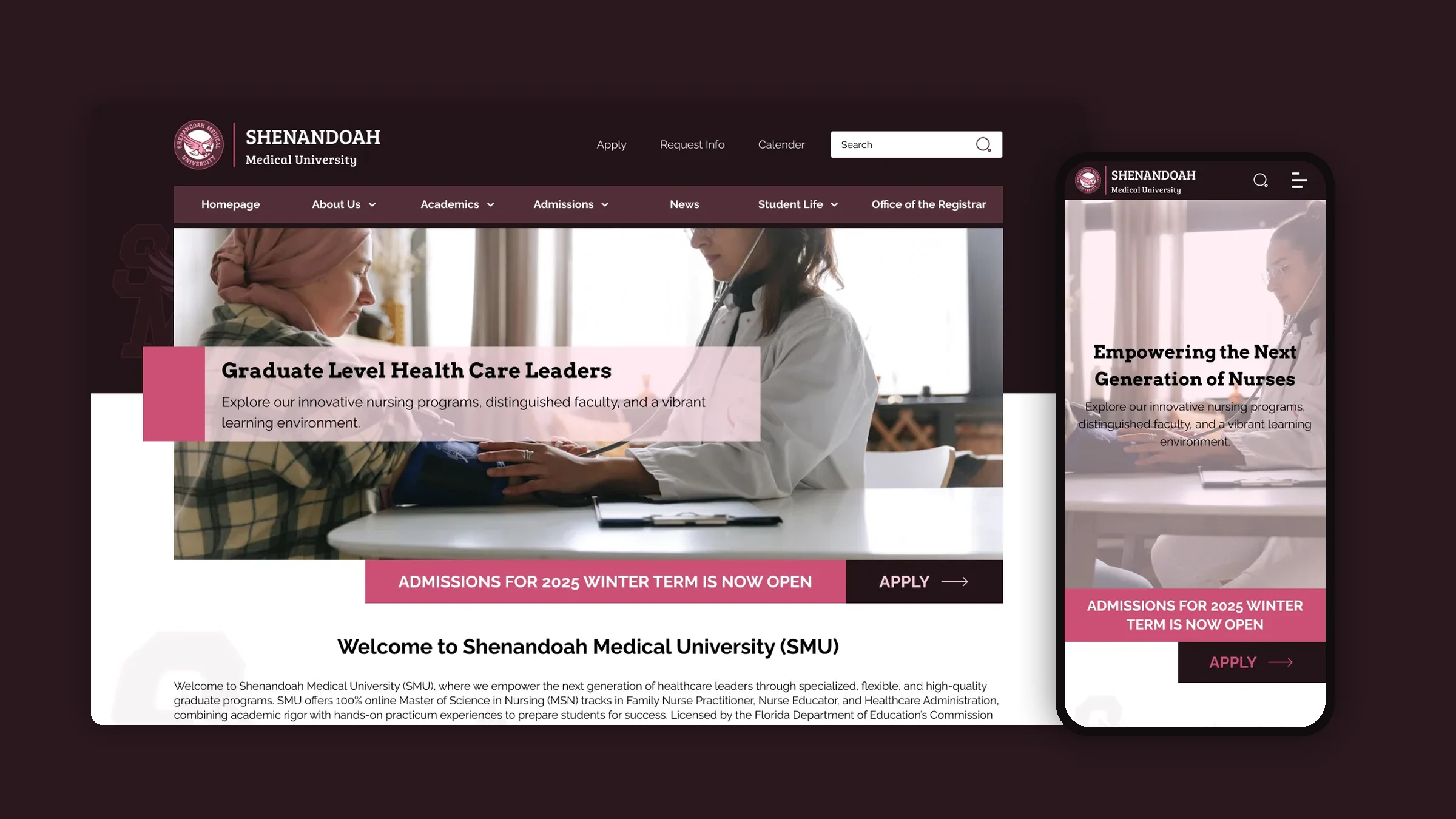
A new website for Shenandoah Medical University, an online graduate school for nurses. I designed every page, for desktop and phone, in two weeks.
Overview
Shenandoah Medical University (SMU) is a fully online graduate school in West Palm Beach, Florida. It teaches working nurses and healthcare staff through three master’s programmes: Family Nurse Practitioner, Nursing Education and Healthcare Administration.
A lot to say, hard to find
Three programmes, admission steps, deadlines, practicum rules and school policies all had to live on one site. Students needed to find the right answer quickly.
Clear, modern, easy to use
A site that looks like a serious school, gets people to the right programme fast, and makes “Apply” obvious on every page.
Two weeks, one designer
I designed the whole site alone in two weeks. Another team built it from my Figma files, so everything had to be clear enough to hand over.
My role
I was the sole designer. I owned the structure, every screen and the style guide. I didn’t write the code.
- Research
- Site structure
- UI design
- Mobile design
- Style guide
- Development
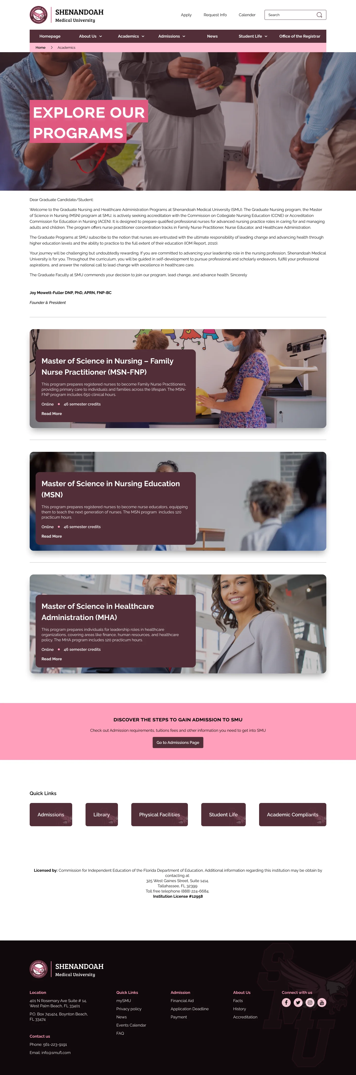
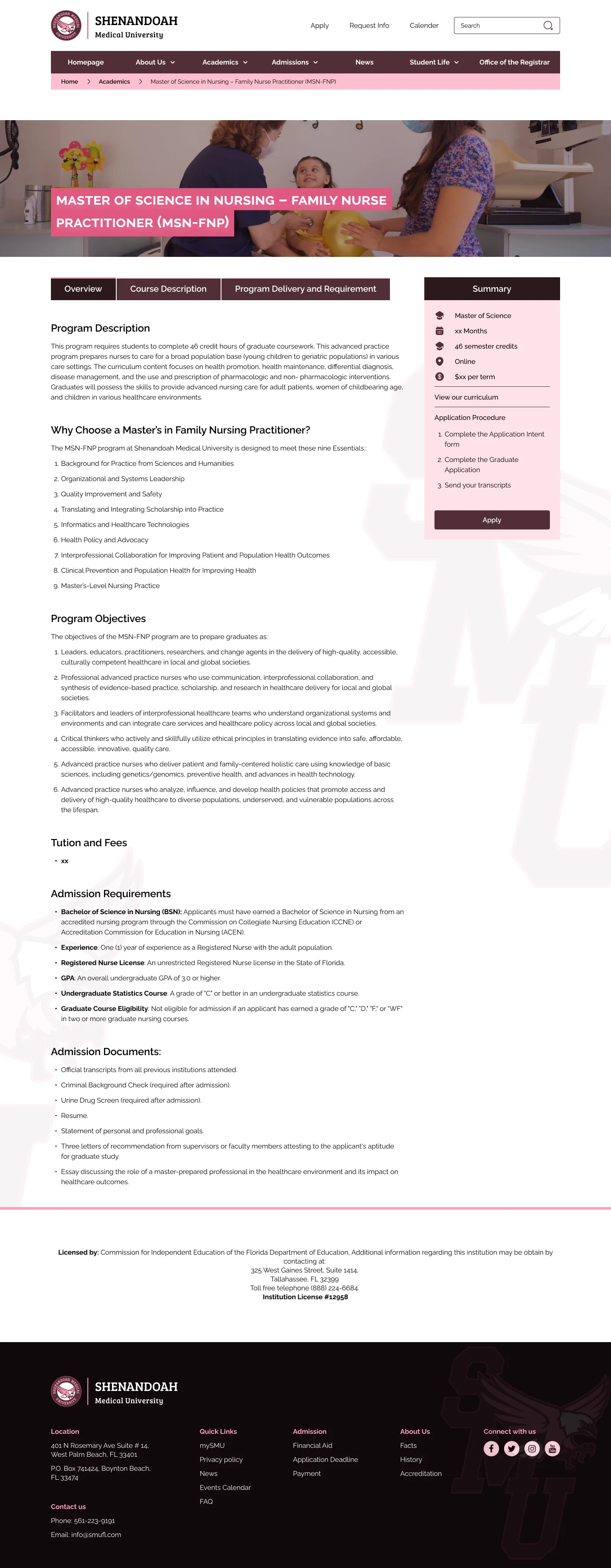
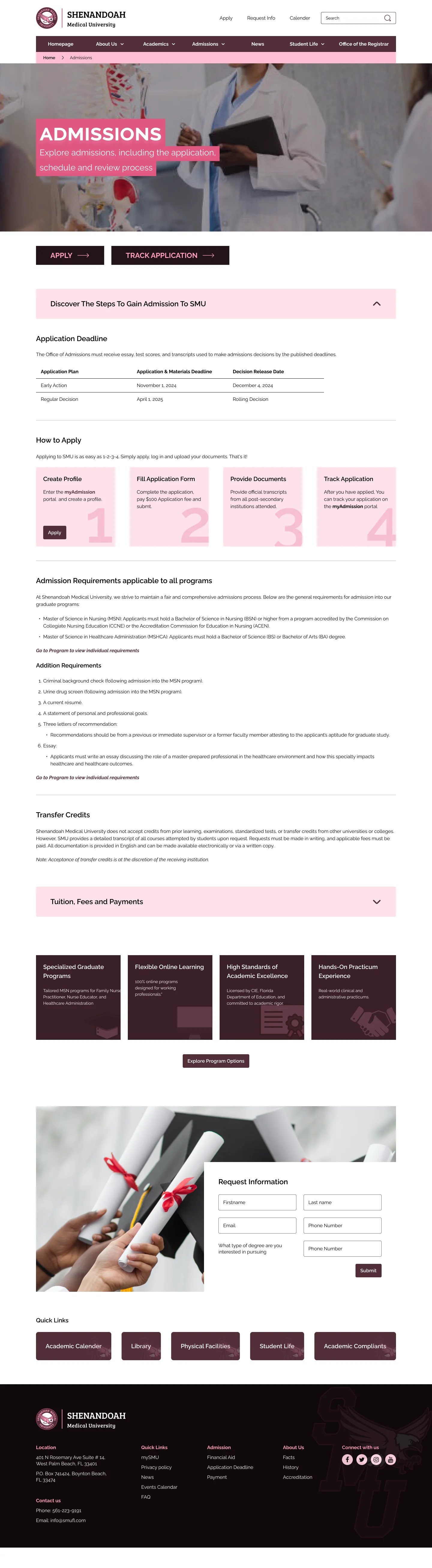
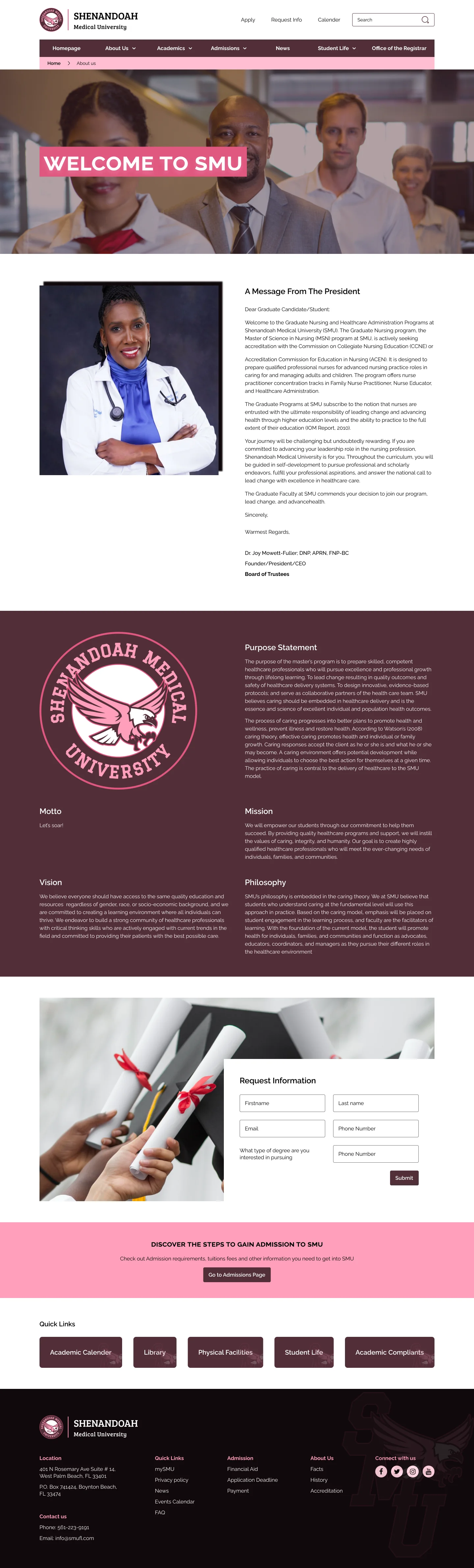
- DesignedEvery page on desktop and mobile: home, about, programmes, admissions, student life, news, FAQ, directory and more.
- DefinedThe style guide: logo use, four colour scales with contrast checks, type, and button states.
- Handed overOrganised Figma files the developers used to build the live site. I didn’t code this project.
Process
- 01Research
Three school sites reviewed.
- 02Structure
Menus and page list.
- 03Design
Style guide, then pages.
- 04Mobile
Every page for phones.
- 05Handover
Files ready to build.
Research & insights
I reviewed three medical school websites, Medical University of the Americas, Feinberg School of Medicine and Augusta University, looking at navigation, accessibility and visual design. I designed for three groups: future students, current students, and faculty and staff.
Navigation is where schools fail
Even strong sites confused first-time visitors or crammed the homepage. So I gave SMU a clear menu, breadcrumbs and search on every page.
Real people build trust
The best sites showed students and staff at work. I used real nursing photography in heroes and programme cards.
Mobile can’t be an afterthought
Slow, cut-down mobile sites were a common weakness. I designed a full mobile version of every page.
Key decisions
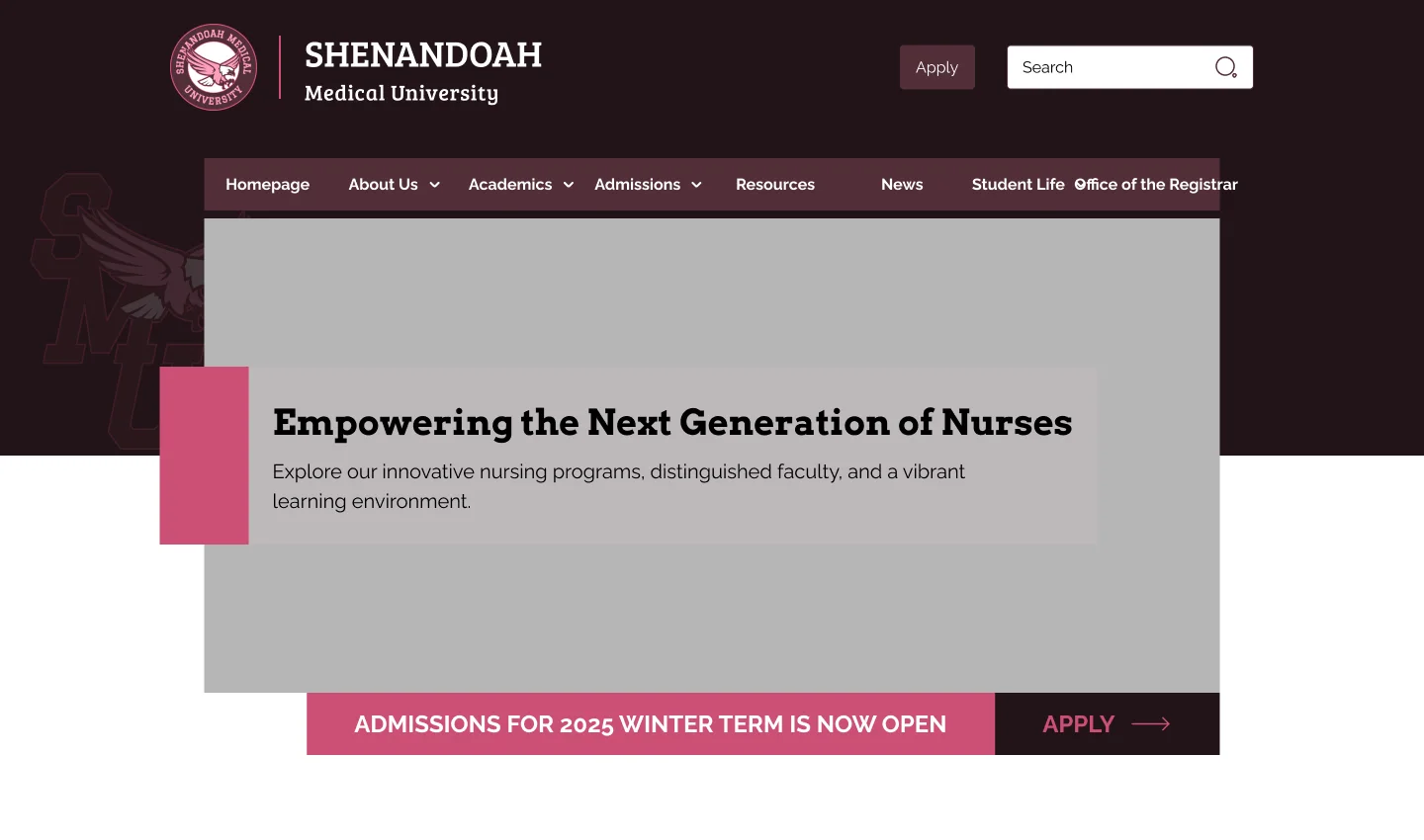
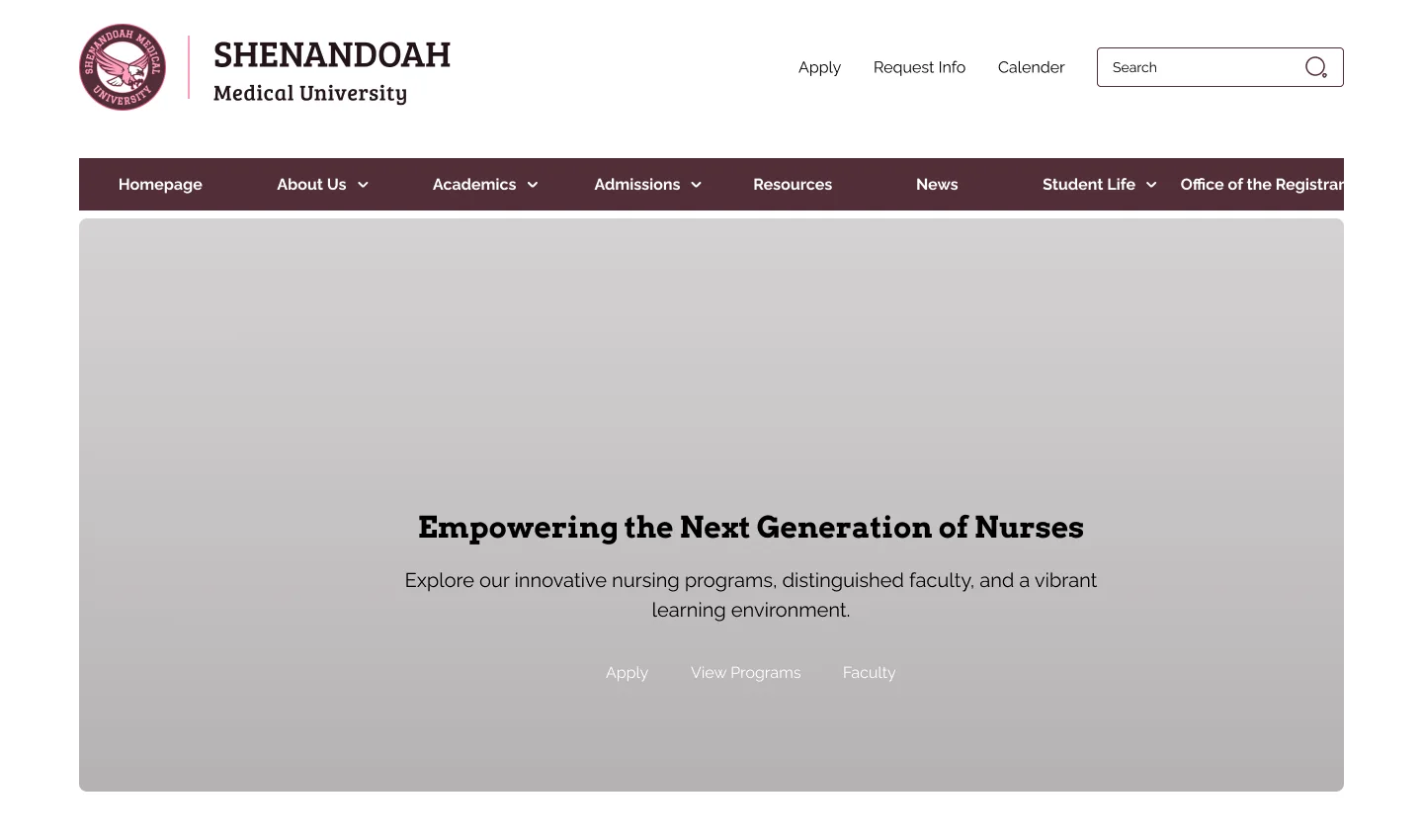
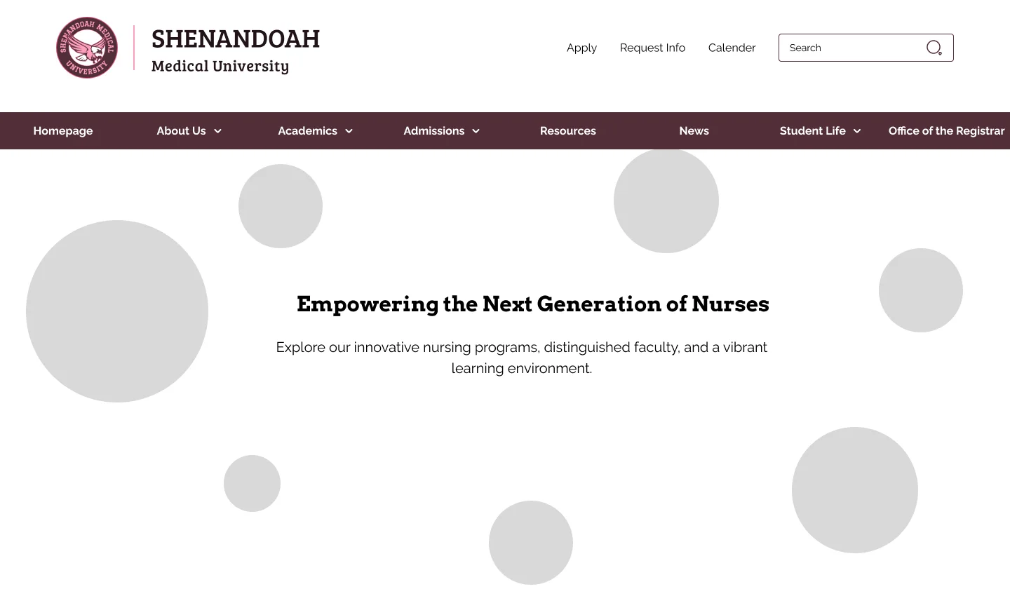
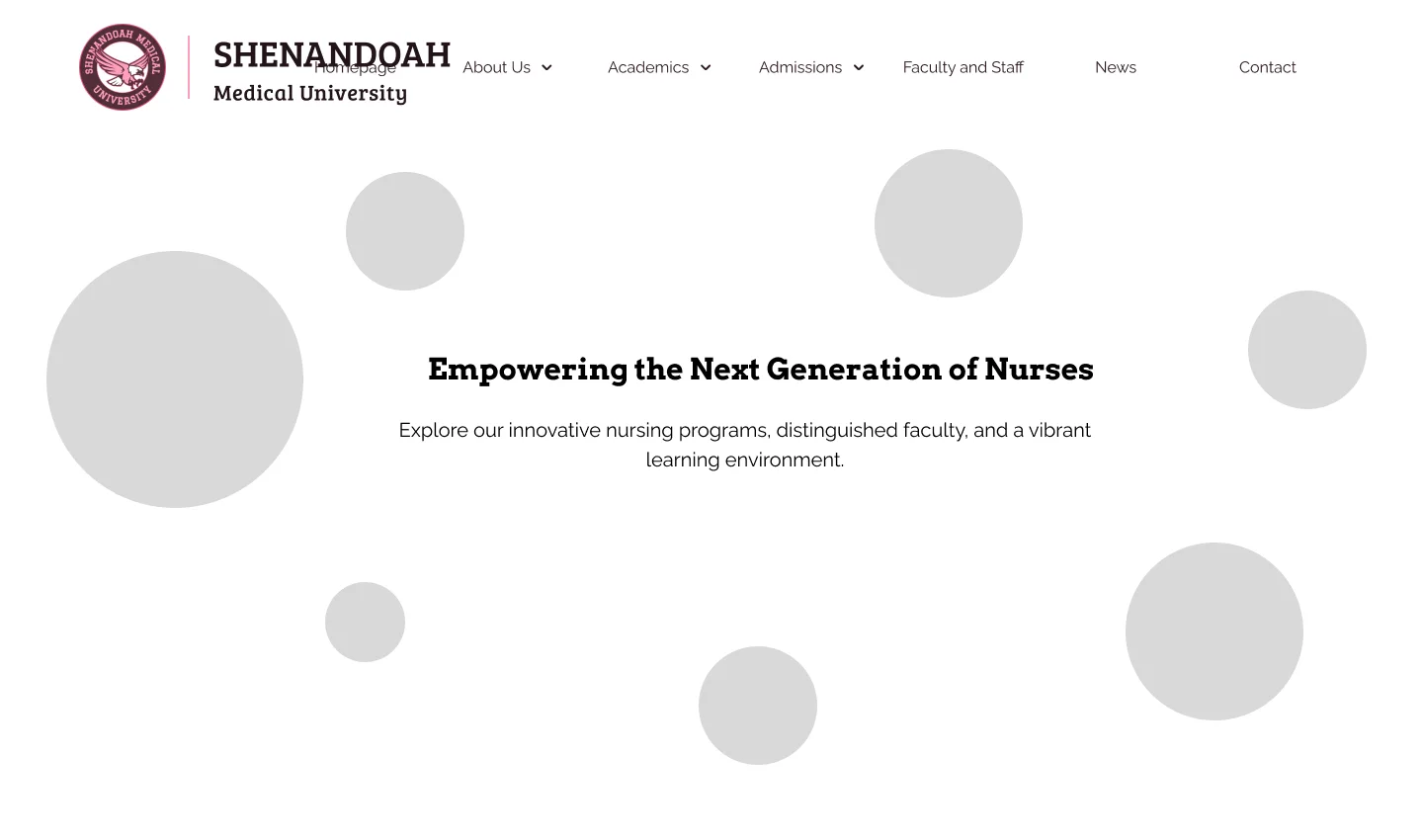
A hero that sells the programme and the deadline
- What I chose
- A real clinical photo with a pink title card, and an admissions bar with Apply directly under it.
- What I explored
- Four layouts, including centred text on plain backgrounds and a full-width image.
- Why
- The photo shows what the degree leads to, and the bar puts the next intake and Apply on the first screen.
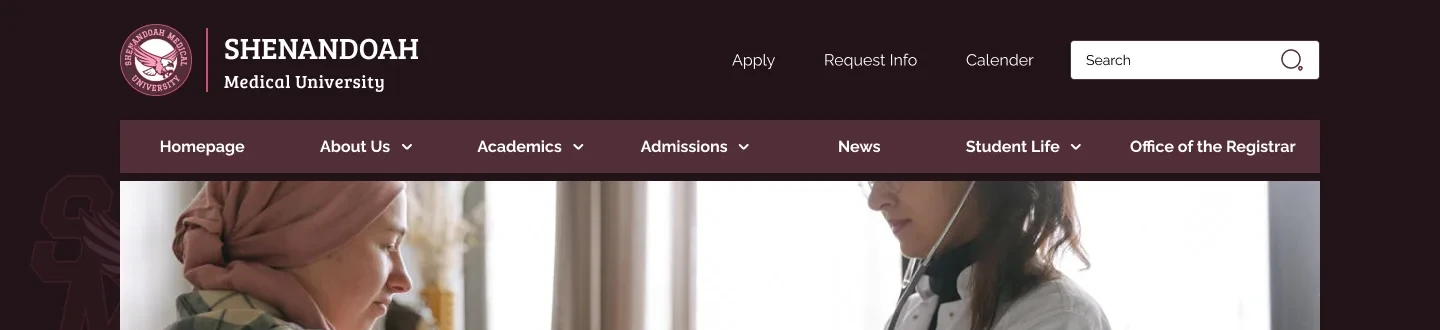
Two menus: quick actions and full sections
- What I chose
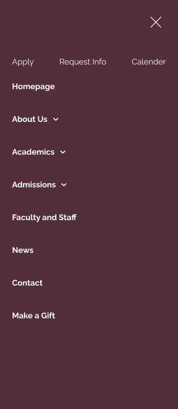
- A top row for Apply, Request info, Calendar and Search, then a main bar with seven sections and drop-downs.
- What I rejected
- One long row mixing actions and sections, as tried in exploration 4.
- Why
- Applicants reach Apply in one click, and current students still find policies and the registrar fast. On phones it all folds into one menu.
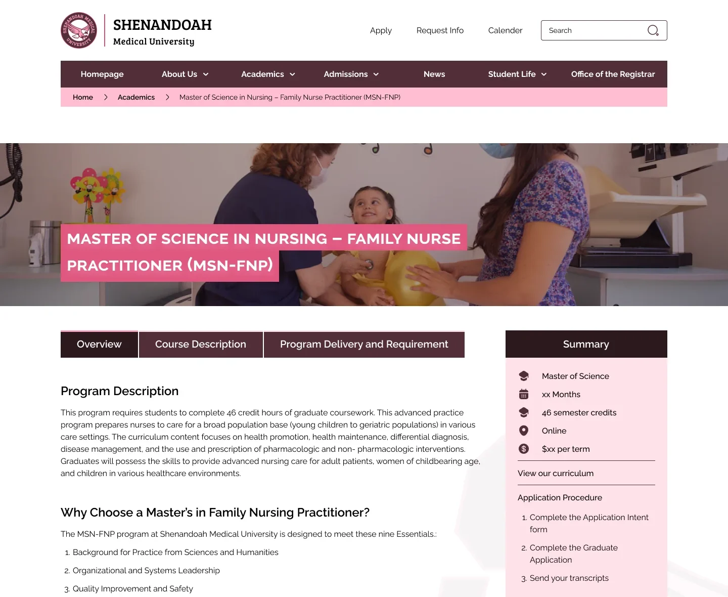
One template for every programme
- What I chose
- A shared programme page: tabs for overview, courses and delivery, plus a summary panel with length, credits and Apply.
- What I rejected
- A different layout for each degree.
- Why
- Students compare programmes side by side, so the same facts sit in the same place. It also made three programmes quick to design and build.
The screens
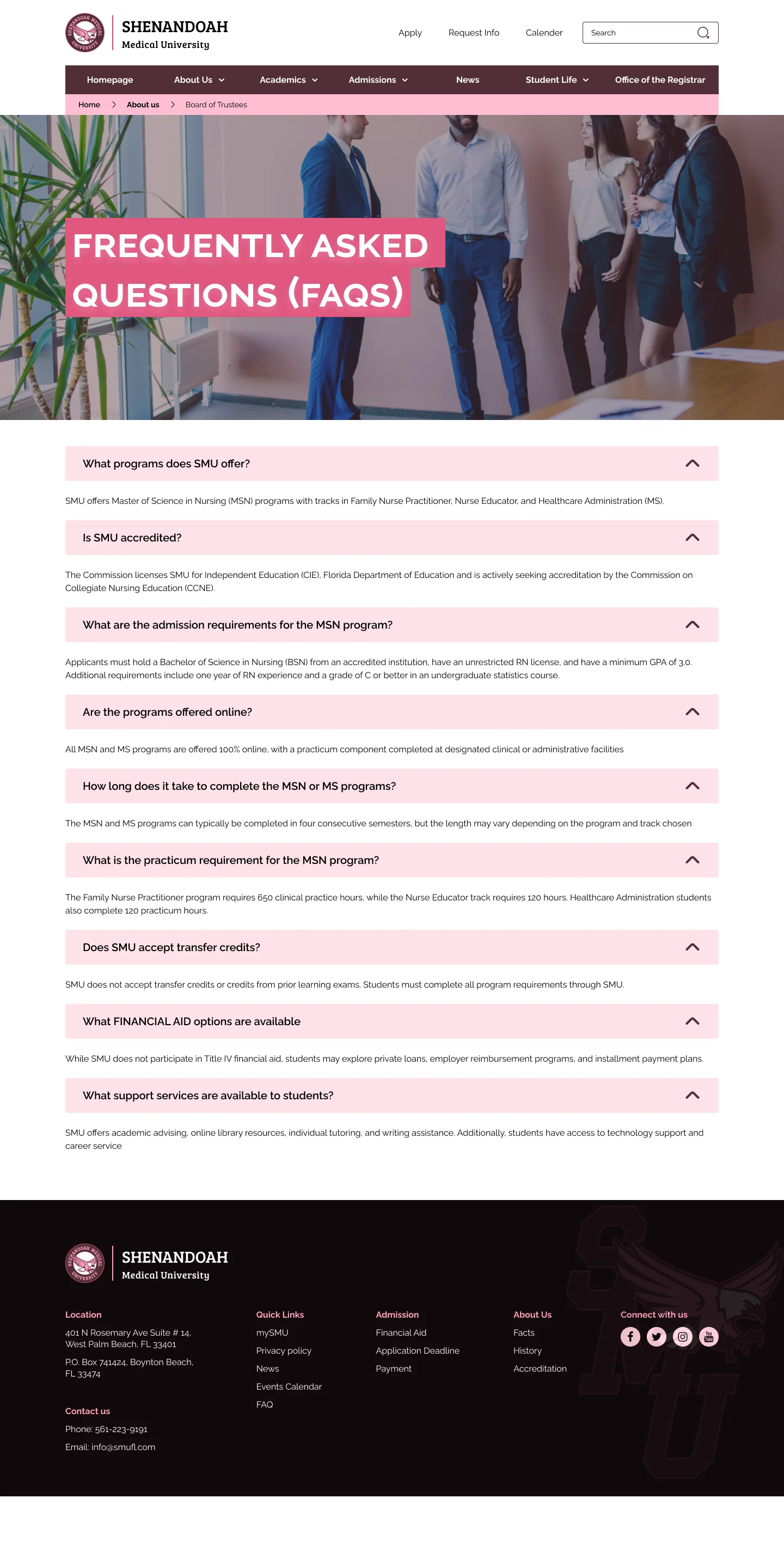
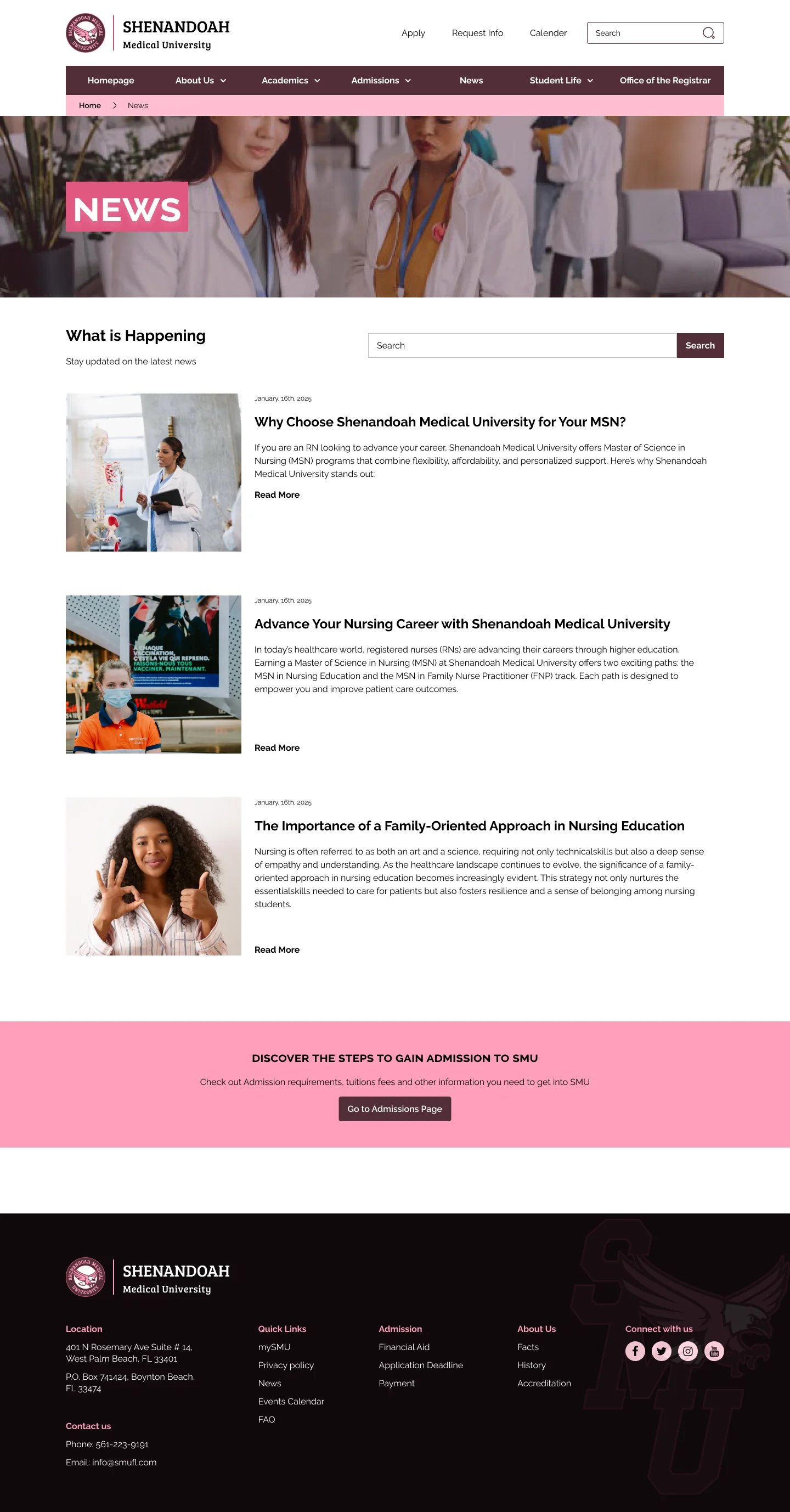
Hover or tap a page to scroll through the whole thing.





Design system
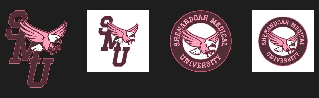
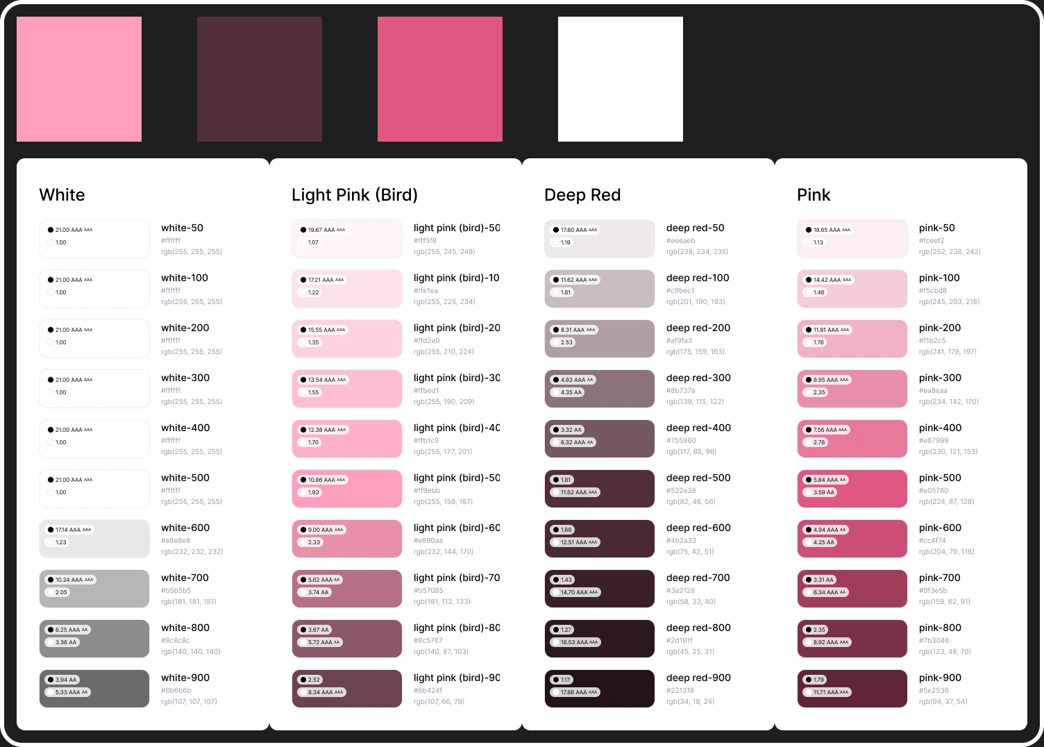
Before the pages, I set the rules: how the crest is used, a deep red and pink palette with contrast ratings for every shade, Arvo for headings, Raleway for text, and one set of button states.
Graduate Level Health Care Leaders
Explore our innovative nursing programmes, faculty and learning environment.
Where it is now
The site is live at smufl.us, built by the university’s developers from these designs. I don’t have traffic or application numbers to share yet.
“Add a quote from someone at SMU about working together.”
What I learned
- One audience is really three. Future students, current students and staff want different things, so each needed its own clear path from the homepage.
- A style guide first makes speed possible. Reusable parts let me design 70+ screens in two weeks and kept them consistent.
- Next time I’d test with real students and faculty before handover, not just review against other schools.