14Pages designed, from the homepage to the sign-up flow
3Audiences on one site: talent, schools and programs, and employers
1Designer: every page, section and component
Overview
Anutio maps what people can already do, teaches what they’re missing, and connects them with work. The website has to explain that to three very different visitors, and send each one to the right place.
The problem
Three audiences, one front door
A student, a career-services lead and an HR manager all land on the same homepage, each with different questions.
The goal
Make the idea feel real
“AI career platform” is abstract. The site needed to show what Anutio does for a real person, then for a whole group.
The deliverable
A complete site
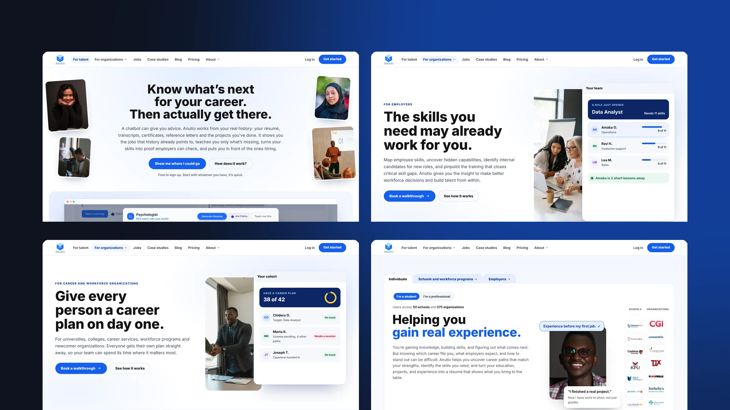
Home, a page per audience, white label, pricing, partners, about, jobs, case studies, blog and sign-up.
My role
I was the only designer on the website, from structure and copy hierarchy to every page you see live.
Information architecture
UX flows
UI design
Responsive design
Components
Sign-up flow
StructuredThe sitemap and the routes for talent, schools and workforce programs, and employers.
DesignedAll 14 pages on desktop and mobile, including the scroll story on the homepage.
SystemisedOne page pattern and a shared set of components, so new audience pages are quick to add.
Key decisions
Let visitors pick their door first
What I chose
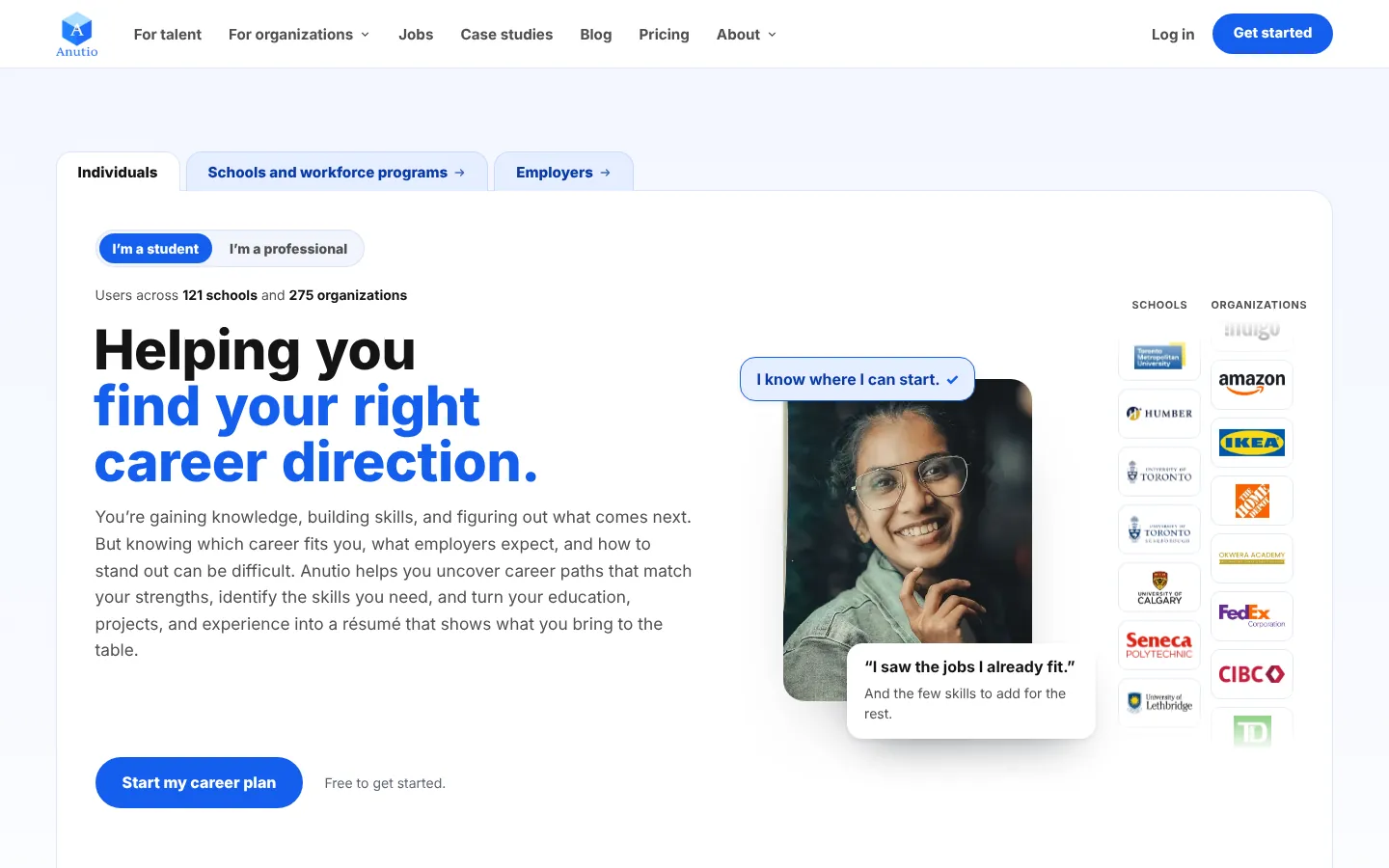
Tabs at the top of the homepage: Individuals, Schools and workforce programs, Employers. Individuals then choose “I’m a student” or “I’m a professional”.
Why
Each group gets copy written for them from the first line, instead of one vague headline for everyone.
Tell one person’s story, then zoom out
What I chose
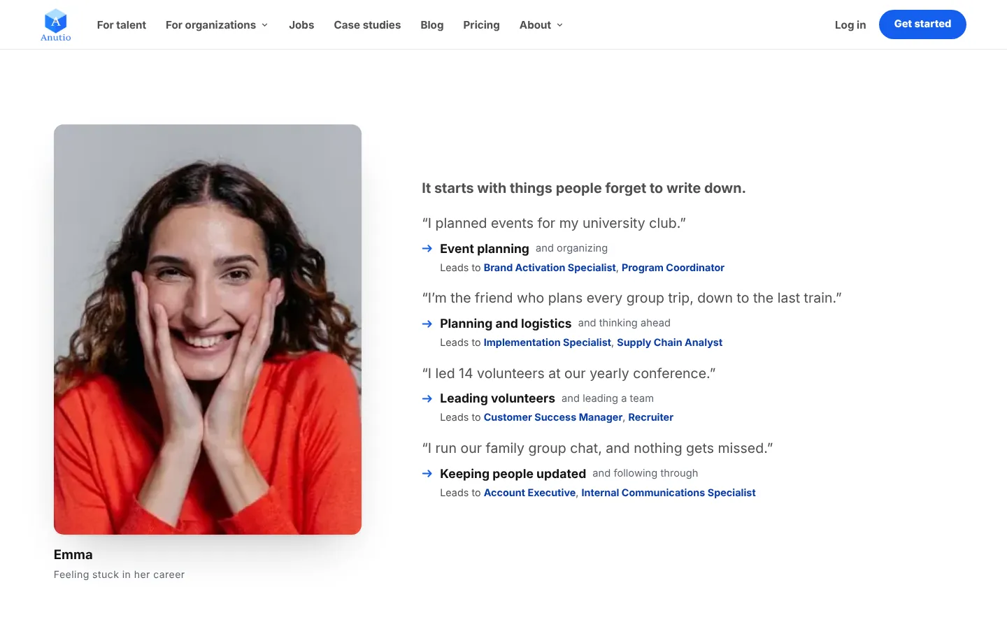
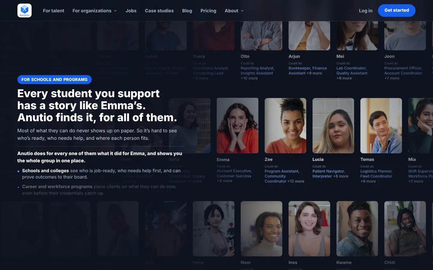
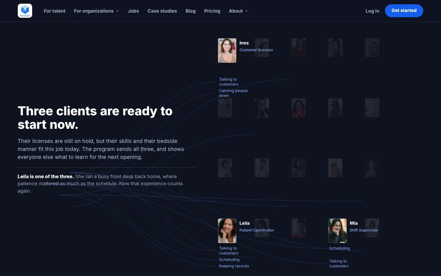
A scroll story. It starts with Emma and the things she forgot to put on her CV, shows the jobs they point to, then pulls back to a wall of people, each with a story like hers.
Why
One person makes the product easy to picture. Zooming out shows schools and employers why it matters at scale.
Show the scenarios each buyer faces
What I chose
Short scenes for each organization type: a college career fair, a newcomer program, a store chain hiring a shift lead. Each scene highlights the people who already fit.
Why
Buyers recognise their own week in these scenes, so the value lands without a feature list.
One page pattern for every organization
What I chose
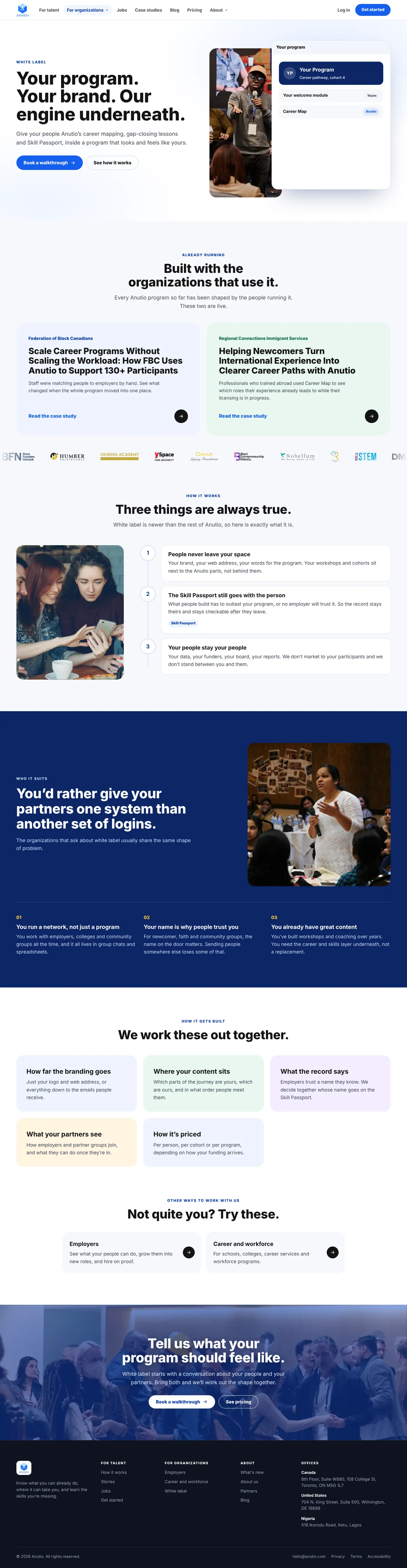
Employers, career and workforce organizations, and white label all follow the same order.
Why
Visitors who compare pages always know where they are, and the team can add a new audience page without a new layout.
The problem
Five steps, in order
What changes
Questions
Not quite you?
One clear next step
Product video
I made a short product video for the homepage. In 20 seconds it shows the whole loop: tap “Teach me this” on a career match, Anutio builds a course from your skill gaps, you take the lessons, and the new skill lands on your Skill Passport.
The “Teach me this” video, playing on the homepage. It loops silently, so it works without sound.
It replaces a list of features with one story people can watch in the time it takes to scroll past.
Motion
Every animation on the site has a job: show the product working, show real people, or tell visitors what comes next. All of them calm down for people who turn on reduced motion.
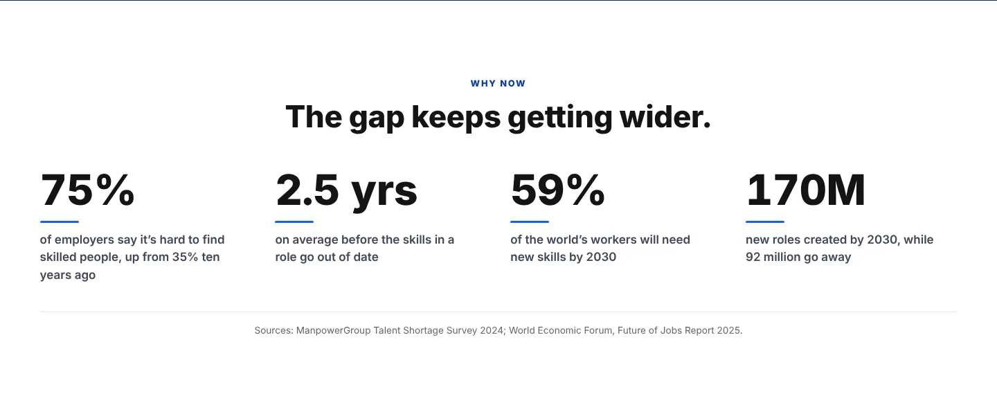
Hero. The coloured line of the headline swaps with the photo beside it, so each visitor sees a goal that sounds like theirs. Logos of schools and employers scroll slowly next to it.Scroll story. As you scroll, Emma’s everyday experience turns into skills and job matches. The view then pulls back to a wall of faces and into scenes for schools, programs and employers.Product walkthrough. A cursor clicks through the real app: Career Map, Teach me this, lessons, Skill Passport and Achievements, with a caption at each step.Wall of proof. Rows of posts, reels and quotes drift in opposite directions. It pauses on hover and has a pause button.Testimonials. The carousel moves on by itself, and a bar fills under the current dot so people can see the next quote is coming.Sign-up. While people pick a path, the panel beside them cycles through a real quote and the numbers behind the problem.
Colour by audience
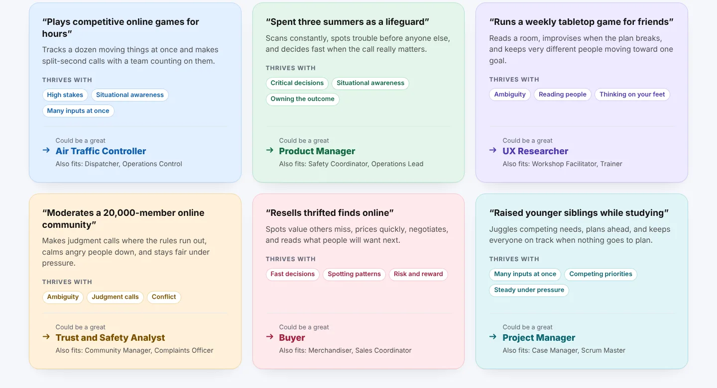
The talent side uses much more colour than the organization side. The talent pages speak to students and young professionals, so they need to feel warm and lively. The pages for employers and programs speak to people buying for a team, so they stay calm and focused on the numbers.
Talent. Six colours (blue, green, purple, amber, rose and teal) give every skill card its own identity. Warm yellow highlights quotes and badges.Organizations. Anutio blue, deep navy and ink only. Colour marks what matters, like the line under each number, and nothing else.
BlueGreenPurpleAmberRoseTealYellow
Each colour comes as a pair, a light tint for the card and a darker shade for the text, so the text stays readable on every card.
Real voices
The testimonials are real. They came from our user interviews with people who used Anutio through partner programs. We kept their own words and named the program they came through.
“Using the platform it helped me improve my resume and the complementary coaching workshop helped me land my interview and internship with Honda.”
Shami Christelle · Talent, via CARY Toronto
“The platform identified key gaps and areas for improvement, giving me a clearer understanding of how to tailor my applications for maximum impact.”
Jackie · Talent, via Okwera Academy
The same voices appear across the site: in the testimonial carousel, on the wall of proof next to the Instagram reels, and on the sign-up page.
The pages
Hover or tap a page to scroll through the whole thing.
For talent: where you could go, how to get there, and how to prove it.
For employers: promote before you advertise.
For career and workforce organizations.
White label: your brand, Anutio underneath.
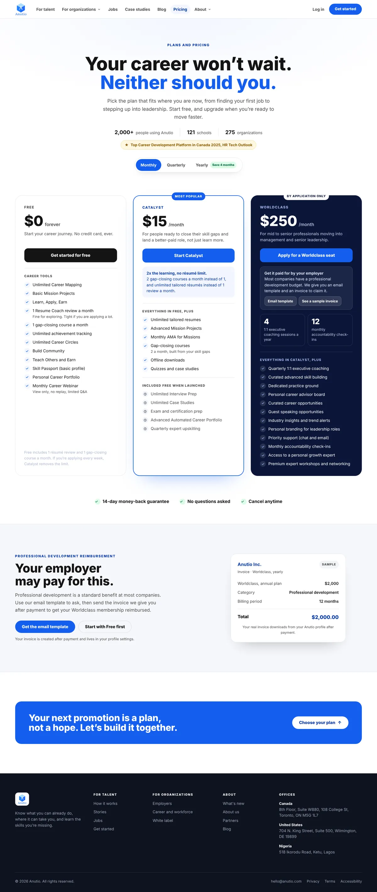
Pricing, with a note that your employer may pay.
About: why Anutio exists and who built it.
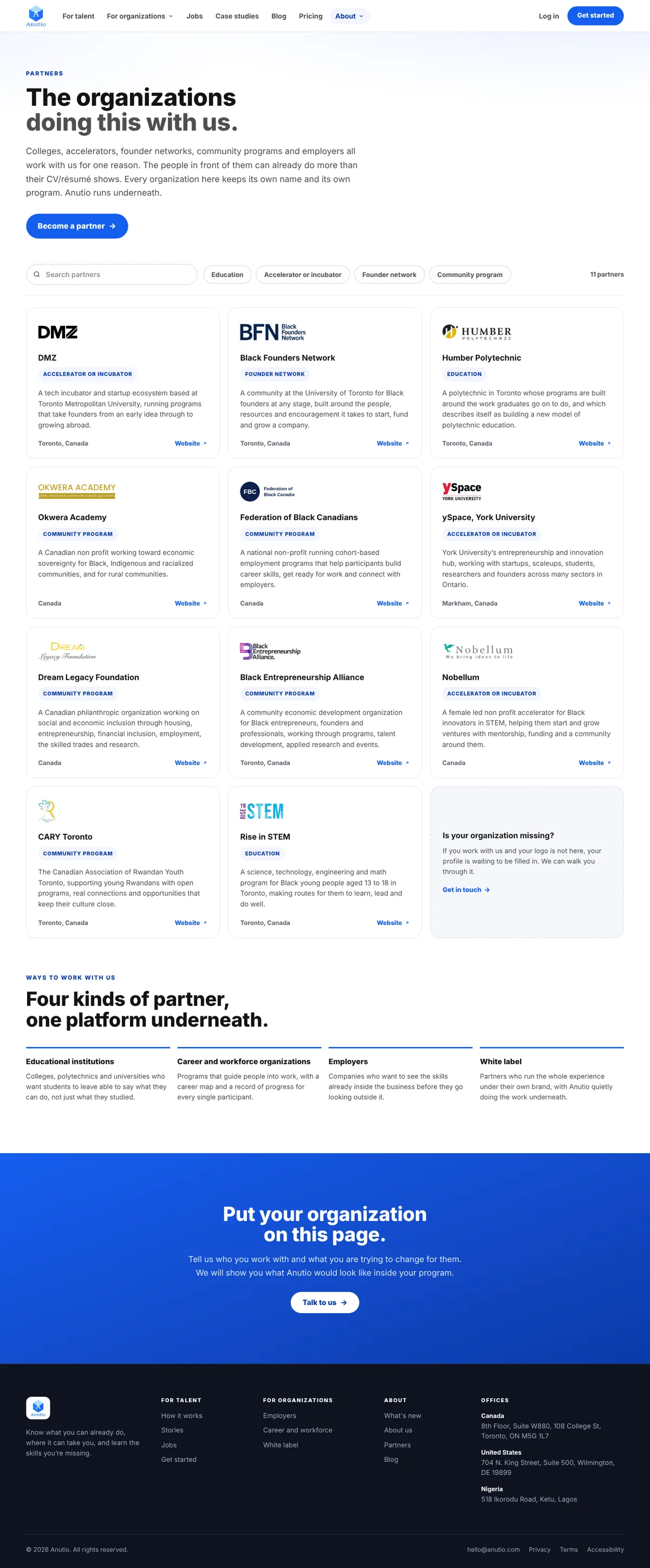
Partners, searchable and filtered by type.
Talent
Pricing
Design system
Anutio blue on a soft white, Raleway for headlines and Nunito for text. The same cards, chips and buttons carry across the site and match the app.






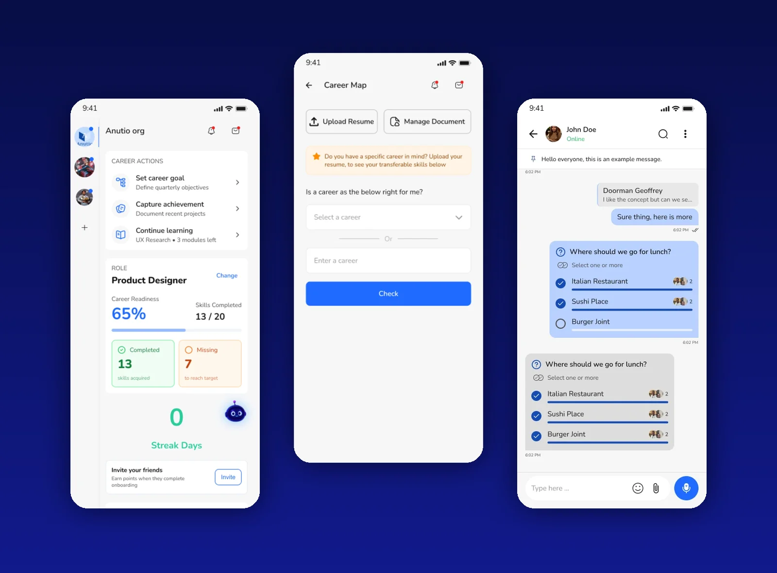 Anutio Mobile App
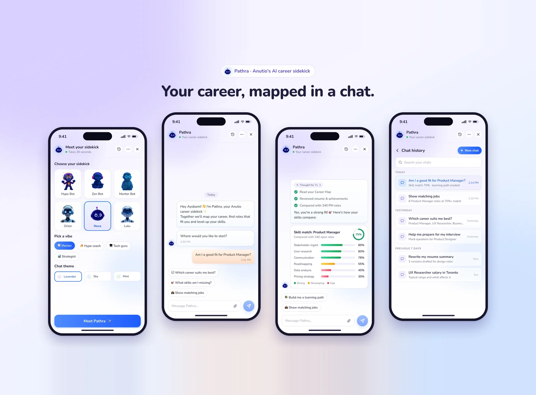 Pathra AI sidekick